In the 1990s, trends changed drastically from the ‘80s when it came to just about everything — including metal album artwork. Airbrushed paintings were replaced by photography and Photoshop, resulting in an absurd number of covers that have not aged well. Photoshop effects that looked cool in the ‘90s are now painful to look at. There was also a trend of creating slightly abstract covers that just look bizarre today. Let’s take a look at some of what the ‘90s had to offer.
Destruction – The Least Successful Human Cannonball (1998)
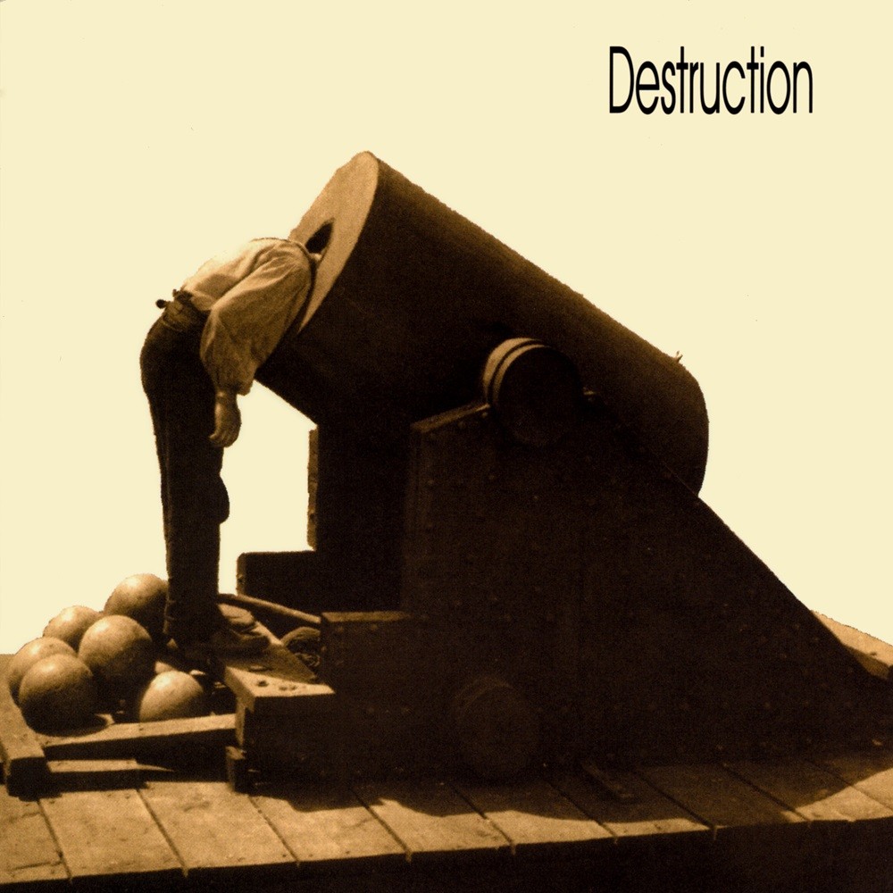
Destruction is one of the best thrash metal bands from Germany. But the ‘90s were extremely tough for the band — vocalist and bassist Schmier left as early as 1989. In fact, none of the lineup from that decade are still in the band today. The worst of their releases during this period is undoubtedly The Least Successful Human Cannonball. Everything about it is bad, including a cover that just looks awful. First of all, their iconic logo is gone, replaced by a generic font. The cover image is of a man sticking his head into a cannon. It does match the album title, sure — but is it supposed to be a joke? Did they design the title and cover just to make a silly gag? If so, it didn’t work. In fact, it was such a flop that Destruction doesn’t even include the album in their official discography.

Dismal Euphony – Soria Moria Slott (1996)
Dismal Euphony was a small Norwegian band that played symphonic black metal on this debut. The album came out during the era when Photoshop was becoming accessible to the general public — hence this brutally bad result. The band actually wanted a painted cover, but Napalm Records insisted otherwise. The cover features a photo of a waterfall, with a Photoshopped image of vocalist Keltziva nude in the water. A floating head appears beneath her. In terms of album art, this is easily among the worst Photoshop jobs of all time. It’s not surprising that they changed the cover for later re-releases — first to just a nude image of Keltziva, and later to a more polished illustrated cover by Danny Larsen.
Enochian – Night Monumental Evil (1996)
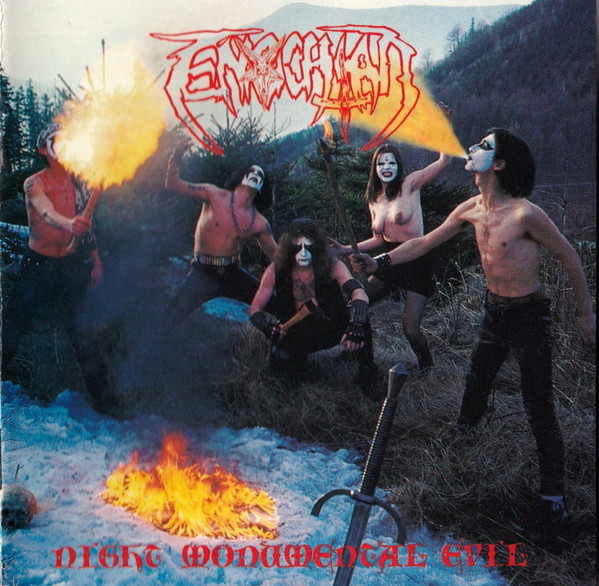
Enochian is a Czech black metal band whose debut Night Monumental Evil came out in 1996. The cover shows the band members out in the woods on an early autumn day, blowing fire in full corpse paint. The image is so poorly executed that it’s unintentionally hilarious. But the real kicker? The band members are shirtless — including keyboardist Lilith, who is a woman. Props for gender equality, but it’s still a bit of a “wait, what?” moment when you see it. The booklet photos are just as funny, especially vocalist Midgard, who sports a plastic Viking helmet and a Norwegian flag. A lot of their lyrics were in Norwegian too.
Esoteric – The Pernicious Enigma (1997)
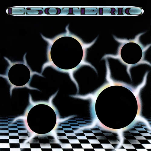
The cover of The Pernicious Enigma falls into the abstract category — and it’s also quite bad. What makes it especially strange is that it looks more like a trance or techno album cover. But Esoteric is a funeral doom metal band. It’s one of the worst mismatches between album artwork and music you’ll ever see. This is what happens when the band’s guitarist, Simon Phillips, is in charge of the cover. He’s probably better at guitar.

Excess – The Fatal Touch (1990)
Excess was a French heavy metal band that managed to release just two albums — both with terrible artwork. This cover looks like a collage of three unrelated images. In the background, some ruins of what might be a castle in black and white, with red windows. In the foreground, a photo of a woman lying in her underwear with glowing red eyes. Behind her, a drawn green demon appears to be about to assault her — also with glowing red eyes.

Fortress – Magic Touch (1998)
Fortress was a German heavy metal band that only released this one CD. I imagine the band meeting about the cover went something like this:
“I have a friend with a cool tattoo of a wizard — pointy hat, stars, kind of Gandalf-looking, but evil with claws.”
“Cool! Let’s use that for the cover.”
“But I don’t have a picture of the tattoo — it’s on her thigh.”
“No worries. Just take a photo of her thigh. Let her wear a small pair of panties. That’ll make it even better.”
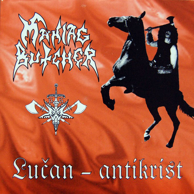
Maniac Butcher – Lučan-antikrist (1996)
Corpse paint on covers started off great with bands like Darkthrone and Mayhem. But over time, it became so ridiculous that you couldn’t tell if it was serious or a parody. Czech band Maniac Butcher took it to the extreme. Just look at the guy on the Lučan-antikrist cover — riding with an axe in full corpse paint. The image of the rider isn’t awful by itself, but the execution is terrible. He’s been cut out, turned black and white, and slapped onto a red background. The result looks absolutely comical.
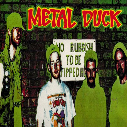
Metal Duck – Auto Ducko Destructo Mondo (1990)
Metal Duck was a British thrash metal/grindcore band known for humorous lyrics. I have no doubt they meant this cover as a joke — but it’s just ugly. Not ugly in a fun way — just plain bad. When I checked them out on Spotify, their plays were very low. I’m convinced the cover scared off all potential listeners.
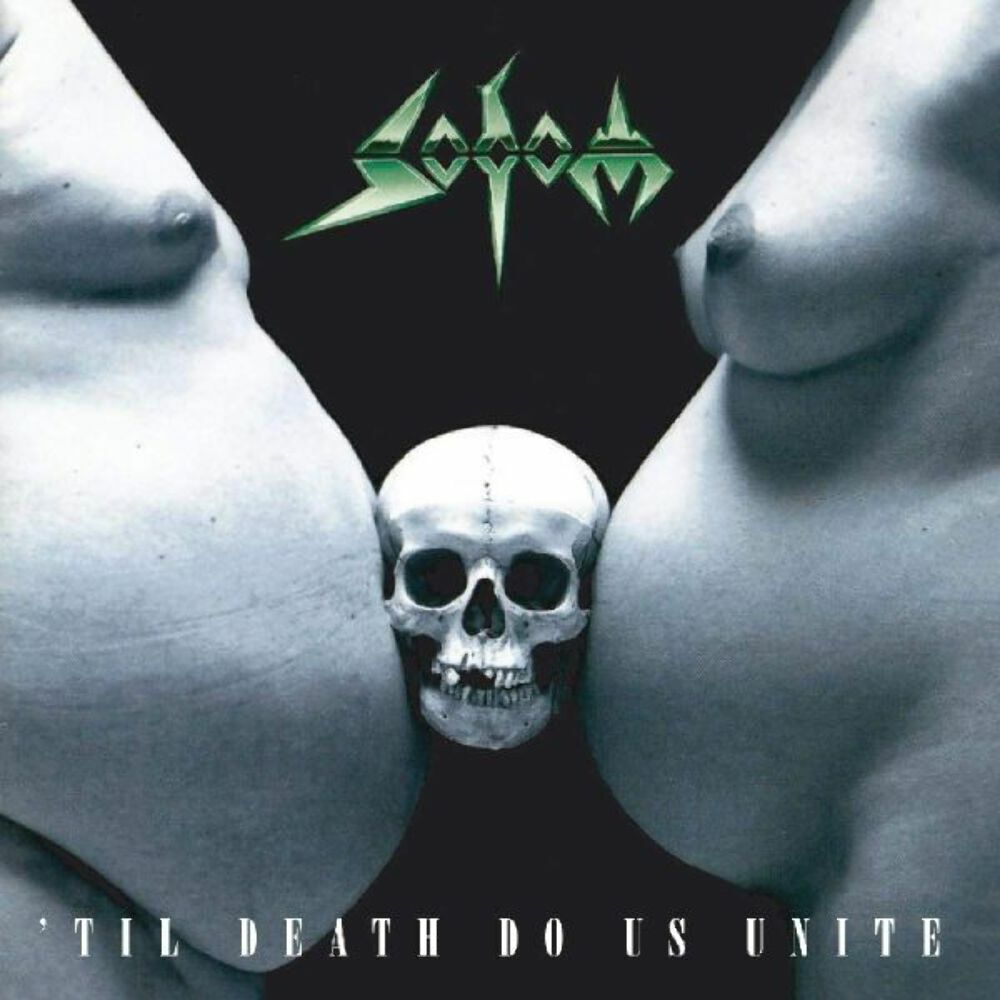
Sodom – ’Til Death Do Us Unite (1997)
Sodom is one of the top thrash bands from Germany. Their ‘90s period isn’t the most well-known, but musically it’s not bad. However, their cover art during this time was… questionable. Take this bizarre piece from 1997. A naked, overweight man and a naked pregnant woman are pressing a skull between their large bellies. I’m sure there was some deeper meaning. But I laughed.
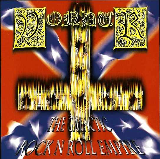
Vondur – The Galactic Rock’n’Roll Empire (1998)
Vondur is the parody band from members of Swedish black metal outfit Abruptum. They’re best known for stealing Star Wars artwork for their 1996 album Striðsyfirlýsing. In 1998, they released an EP where vocalist All played around with Photoshop. He managed to create an upside-down cross using a fire effect — the kind of thing people loved to play with in ‘90s Photoshop. I remember messing with that effect myself back in the day. But for those who used it seriously… yikes. The Confederate flag in the background doesn’t help either.
